
About the Project
I was hired by non-profit organization Transforming the Bay with Christ (TBC) to lay out this data report for print and digital publication. The report dissects the needs of public schools, teachers, and students in the northern Bay Area as an empirical resource for churches seeking to improve their surrounding communities.
My role as the lead designer was to create a cohesive visual theme for the report, adjust data visualizations to the theme and organize the written content of a physical booklet and digital publication, start to finish.
Client: TBC
Collaboration With: Veronica Haniger (Organizer), Adam Peacocke (Organizer), and
Kathleen Houssels (Researcher)
Kathleen Houssels (Researcher)
Tools: Adobe InDesign, Adobe Illustrator
Key Ideas: Effective Data Visualization, Clarity, Client Collaboration
Unifying Data Visualization
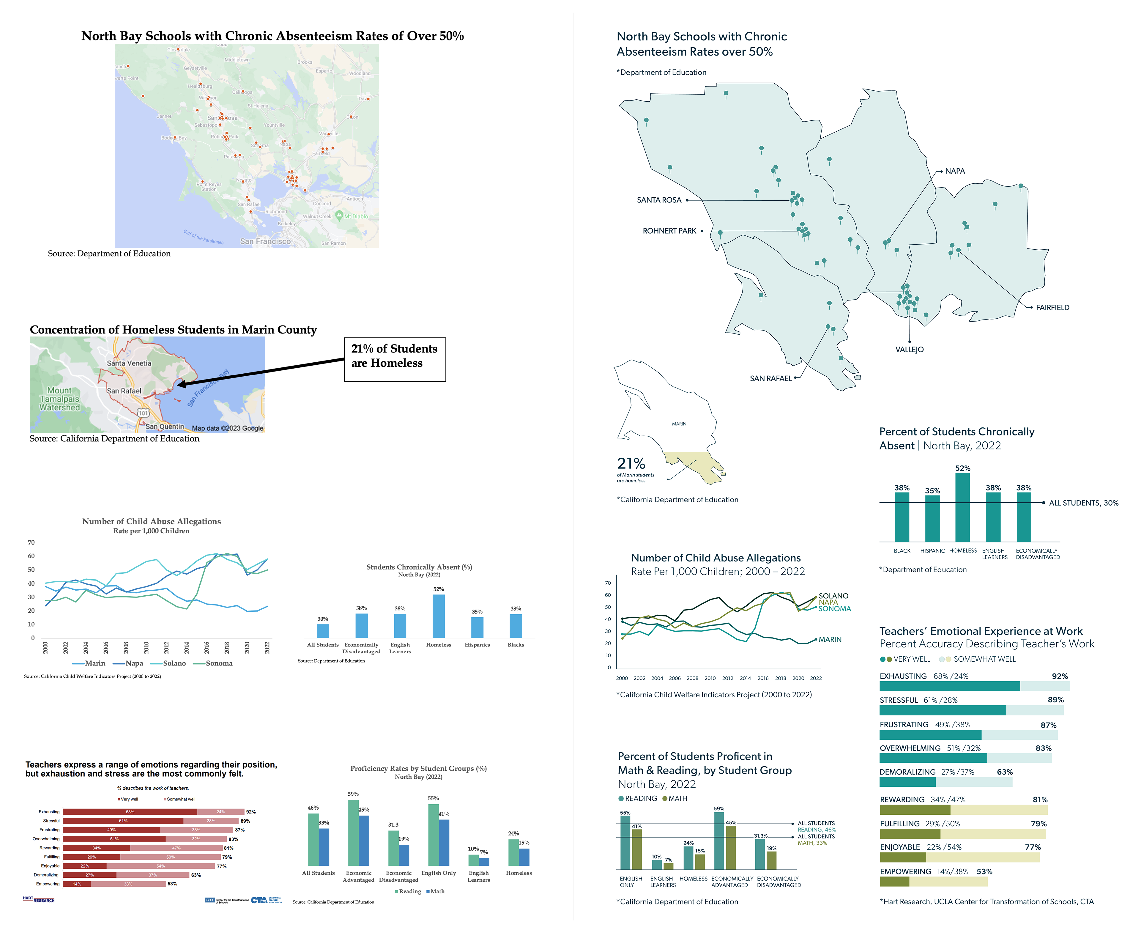
To transform this report into a professional resource, I reworked the eclectic collection of data visuals developed by the researcher into a unified body of graphics. My goal was to streamline the presentation of data for efficient reader comprehension. I also utilized high color contrast and variation to make the data visuals stand out, since the data is the most critical component of the report. The color scheme was inspired by the colors of the northern Bay Area coastline.
Final Booklet
This project taught me a lot about the process of applying a master typographic grid to a complex body of content. Where is the consistency of the grid valuable? Where is it okay to break up the grid for more dynamic layouts, and to emphasize important information? How does the size of such elements need to flex in order to keep all related content on the same page for easy reading?
Below is attached the final digital publication used by the client. However, the client also had physical copies printed to distribute to the different churches they support.